Importance of visuals in the healthcare marketing

Why is it essential to integrate visuals into healthcare marketing? How can visuals increase trust and brand awareness?
Visuals: their importance in the healthcare marketing
Unlike other industries, healthcare is subject to more complex scientific and government regulations. While these regulations may vary slightly depending on the type of digital solution, they commonly hinder the adoption of some marketing tricks. One of them is attracting your physician-oriented audience through visuals.
Underestimating visuals is a significant pitfall when developing a marketing strategy
It seems that visuals are the last thing medical companies pay attention to when generating a marketing campaign. Compliance with data privacy regulations or choosing the right technical stack is much more crucial. It's hard to argue with that, because medicine and visuals appear incompatible.
However, digital medicine is bound by common market rules, in which users, including the digitally savvy HCPs, first perceive an attractive picture and only then a message behind it. People remember only 10% of information without visuals. However, if the information was paired with an image, people retain 65% of the information after 3 days [1]. What’s more, about half of marketers rate visual marketing as "very important" when building a strategy [2].
Therefore, your product should be not only functional but also well-designed. But even with that functional “filling”, it сan be hard to sell without an appealing “wrapper”. In fact, billions of pharmacy names, prescriptions, drug descriptions, research results and other pharma-related information are completely ignored due to the lack of striking design.
Your message visualization is paramount even in digital medical marketing: why?
The way you combine your content with appropriate images impacts how physicians perceive your product. For this reason, your design can either encourage or discourage physicians from using your product.
Design can be a unique tool in appropriate hands, leading to the following.
#1 Trust
Positive impact on human emotions through visuals can also improve brand awareness → stimulate engagement → increase trust → lead to actions (using the services your company provides, downloading the app, etc.).
#2 Targeted message
Picture-enriched content helps you get your message across faster than just text. Here are some examples of messages that can reach your audience faster with relevant visuals:
- Product demo
“Potential customers are 64-85% percent more likely to try a product or service after watching a video about it”, as per the source [3].
Indeed, demonstrating the product, its functionality, and its usefulness in an interactive video format can assist a doctor in understanding your intricate medical product and assessing the degree of need for it.
- Customer reviews and success stories (aka case study pages)
Positive testimonials have a direct impact on trust increase. You can dilute text-only reviews with pleasing graphics to draw users more quickly and simplify their decision-making.
- Backstage videos
Customers are often meticulous when selecting a product or service. Good reviews may not be enough to get a doctor to make the next step in the healthcare marketing funnel. They need more information about the product. Behind-the-scenes videos can become a source of that additional information.
Consistent branding
A unique color palette and consistency in providing your audience with visual-rich content can boost your brand awareness. Customized colors matching your product can be your ultimate trump card.
Captivating design + physician loyalty = more odds of brand success.
Note: By incorporating visuals into a content part (blog, social media posts, white paper, etc.), you simplify the delivery of your medical message. A quality message, in turn, should be based on thoroughly validated scientific data. Digital doctors will be more receptive to such data, perceiving most of the information you provide.
Finding: The development of improved data imaging assists in saving lives, allowing physicians to reduce cognitive load and make better decisions.
How to combine medicine and visuals: tips from Brandmed practice
The main thing is balance: visuals cannot dwarf the text but rather highlight its importance and facilitate its reception. . Here are 3 basic types of visuals that can be considered must-have design aids:
1. High-quality photos
When faced with your product or service for the first time, the doctor will be unsure. Confusion is normal. Hence, the challenge is to get them to feel comfortable. The visual content of your product can help them get through the "confusion" and build a sense of trust. This visual content can be product photos, behind-the-scenes shots, or the product creation process.
The key is to make sure the photos are professional and consistent with a positive image of your brand.
If you want to learn more about why high-quality images are essential in online medicine, you can read this article.

2. Illustrations and motion graphics
If high-quality photos aren't quite your format, you might consider creating 3D medical illustrations. They can demonstrate not only your focus on generating quality content but also simply convey complex information.
3. Videos
Video has become a dominant power in content marketing for a reason: it's an effective way to get information quickly and efficiently, especially among millennials [4]. If your product has been designed for this age group, it is advisable to consider incorporating video content into your marketing strategy.
Design-wise: how to pick a color?
Color makes the information presented more readable and determines its visual hierarchy.
Moreover, it is desirable that the same color scheme accompanies your brand and related content. In this way, you will quickly obtain brand recognition and uniqueness.
An important aspect of color selection is your audience and their preferences. According to a study conducted by 99designs [5], blue, followed by white, is the most popular color used in healthcare design.
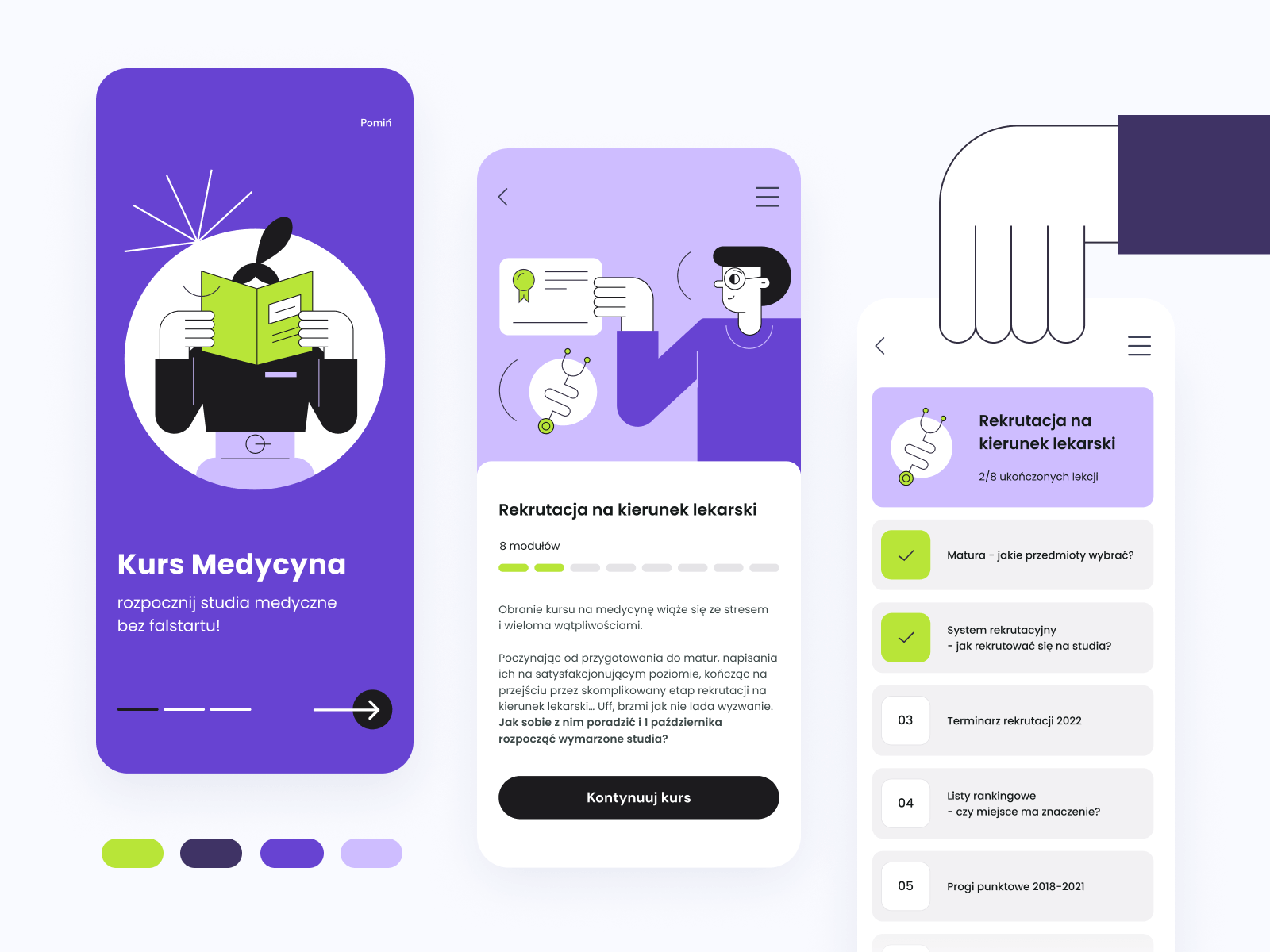
Yes, the market is full of pharma applications with an emphasis on blue. However, other colors should not be neglected. The main thing is to correlate it with the brand and satisfy the audience's sympathies. For example, in our recent case — Source: Medicine — we decided to use a blend of violet and green. The reason for this choice is the audience. Compared to the traditional blue color palette, this one is more casual and appealing to future medical students.
Is your marketing lacking eye-catching visuals? Brandmed marketers and designers with medical backgrounds are here to help you make your brand unique. Contact us.
References:
- Brain rules, brain rules by John Medina, http://brainrules.net/vision/, [last accessed: 31.10.2022].
- Venngage, 16 Visual Content Marketing Statistics to Know for 2022 [Infographic], https://venngage.com/blog/visual-content-marketing-statistics/, [last accessed: 31.10.2022].
- Neilpatel, Can Product Videos Increase Conversion Rates? https://neilpatel.com/blog/product-videos-conversion/, [last accessed: 31.10.2022].
- Hubspot, Content Trends, https://blog.hubspot.com/marketing/content-trends-preferences, [last accessed: 31.10.2022].
- 99designs, The logo colors of healthcare, https://99designs.com/logo-design/psychology-of-color/healthcare, [last accessed: 31.10.2022].
 Medical Content Creation
 Digital Product Development
 Growth Marketing


