 Medical Content Creation
 Digital Product Development
 Growth Marketing
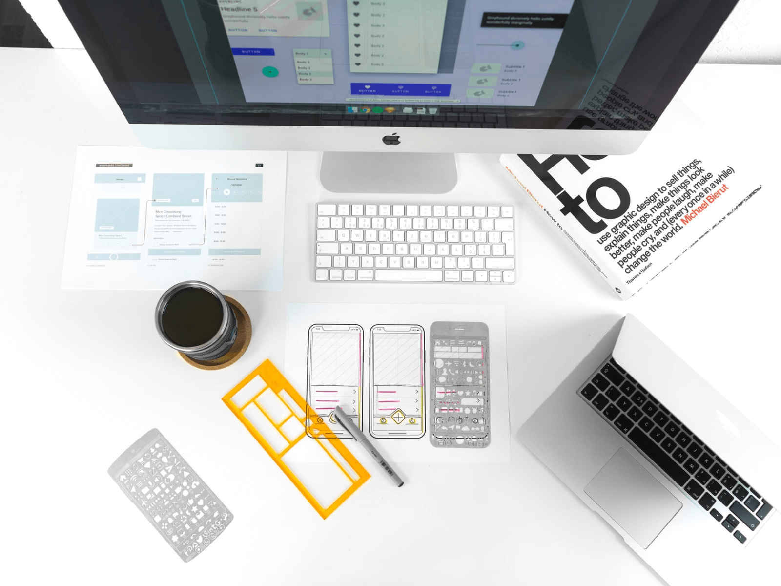
Importance of visual hierarchy in graphic design
Color, size, position, and 5 more hierarchy components to be considered while designing solutions for them to stand out.
The medical business has undergone profound changes in the wake of the COVID-19 pandemic. The ongoing digital transformation tries to, among other things, conform the created content to the drastically reducing attention span. In an age of overloading the Web with tons of information, users want to pull out quality information with minimal time.

A popular concept of minimalism, introduced in the 1960s, empowers customers as never before to meet their needs quickly and with the ultimate hands-on experience.
The answer to effective design is simplicity itself. However, it is a demanding task, especially when the solution is of considerable complexity.
For years, designers have developed (and continue to do so) a scheme for providing visual information in the most user-friendly way possible, taking into account users' psychology of perception. Considering the reduction of the human attention span with each passing year [1], luring users is becoming a more demanding task.
How to make a digital solution stand out among the many similar ones and draw customers' eyeballs? Visual hierarchy in graphic design is here to address the issue being the basis of the right visual cues.
What is visual hierarchy?
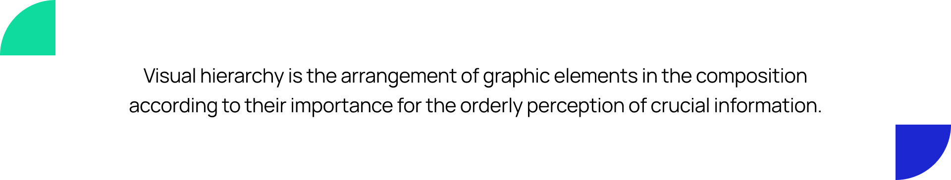
Visual hierarchy is the arrangement of graphic elements in the composition according to their importance for the orderly perception of crucial information.
The hierarchy is based on the Gestalt principle: the human brain seeks to find order in any disorder by creating patterns and giving birth to a unified system. So, according to the visual hierarchy pattern, the viewing model is driven by two different cognitive processes: searching and scanning [2].
The visual hierarchy of interfaces dates back to the Renaissance, where the primary goal of the design was aesthetics. Contemporary digital design, besides aesthetics, serves other purposes: promoting specific content, encouraging subscriptions, following CTAs, and achieving users satisfaction through the impressions made on them [3].
The critical components of the hierarchy are color, contrast, size, space, and position. Designers generate the necessary focal points within a technical solution to make it easy for the human eye to perceive and process a visual message.
Hierarchy-free design
A well-designed solution implies the coherence of the entire composition, which a designer helps to perceive through the creation of its parts, each of which has its priority and level of intuitiveness.
As a result of the lack of that very priority within parts of the site and, in fact, deprivation of design hierarchical visual representation, 2 scenarios emerge:
- Confusion
The lack of integrity leads to confusion, making it impossible to accurately convey the message.
- Pointlessness
What? Why? How? This is a minimum set of questions that a site should answer through a visual performance. If a user doesn't get an answer, then a business message is not considered effectively delivered.
To avoid such scenarios, follow the main visual hierarchy principles in graphic design that can turn a solution into a user-friendly UX.

Go-to principles to obtain visual hierarchy in graphic design
Z & F reading patterns
According to how information is screened, there are two main patterns — F and Z.
F pattern is considered on pages full of text (blogs, articles). It involves a viewer scanning the information from the left in search of what is needed and then moving from left to right if the desired information has been found.
The Z pattern applies to other types of pages without a block layout (a landing page, for example). It involves a viewer reading the content at the top of the page and then moving diagonally to read the information in the lower-left corner.
ProTip for designers: It’s advisable to keep the patterns in mind before designing because they define the product roadmap and are just as important as clearly defining the audience before launching a project.

Size & Scale
The more significant object, the more attention it draws. It's a universal but still key principle to follow while designing a digital solution.
ProTip for designers: Indicate crucial parts that need to be highlighted first (headlines, CTA-buttons, etc.) and prioritize them over other parts by simply increasing their scale.


Color & Contrast
Here's another logical concept: bright colors have a more remarkable focal point than unsaturated ones or grayscale.
It doesn't mean that it’s required to leverage solely bright colors of different hues in any design part as it can only annoy users. But adding a splash of bold color among a muted one will draw attention to the information regardless of whether it's: on the right or left side of the page. Also, brighter colors are considered more engaging on a darker background.
Adhering to the same gamut with the proper emphasis creates a unified concept of the entire app design.
ProTip for designers: Decide on a color palette in which identify one or two dominant colors. It is preferable to leverage triadic colors and make a balance between primary and secondary colors. Also, the dominant one shouldn't always be bright (pastel ones are also quite suitable in design).


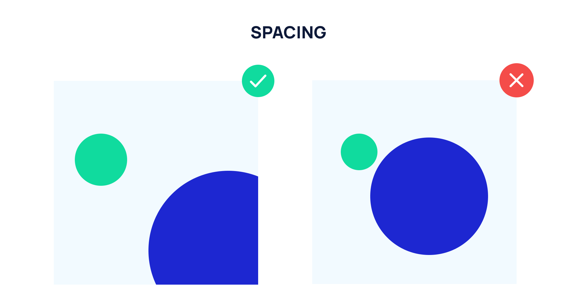
Spacing
A common rookie misconception in the web design space is that every corner of the page should be filled with relevant information as white space is considered a blank one rather than a design tool. Now, "breathing" designs are becoming more and more common.
The answer lies in maintaining the right amount of space between the essential elements to keep your audience in the spotlight.
Clutter works like a snowball for users who first came across a page. The white space technique involves using negative spacing between the design elements. It allows organizing them into specific focal points, improving the legibility by making the content more discernible.
ProTip for designers: Try to cut down on elements per page so as not to overwhelm the audience but also not to break the fine line between minimalism and dullness.
Proximity
Proximity is defined as the placement of similar elements in a nearby environment. In this way, a viewer perceives the information more lightly and does not lose the connection with the transition from one group of similar elements to another. It is precisely what is needed!
ProTip for designers: Group the elements according to their similarity and the semblance of the message they convey.


Typography
The position most often comes into play when planning which item people might focus on first [4]. But some design-related people emphasize the importance of not only the position but also the text's style [5].
Typography implies the style and appearance of text. Or in other words, combinations of fonts with different sizes, weights, elements, and other components used to convey a digital message.
The choice of font directly affects the "personality" of the design. So even if the design looks "quite ordinary," — a well-chosen font plays a pivotal role in the graphic design of your solution. Therefore, the basic principles of an effective design strategy will allow you to create an outstanding design.
The proper organization includes three main components of the hierarchy — title, sub-title, and body copy.
ProTip for designers: Make sure you decide on a font full of readability and legibility to not turn your creative approach against yourself.


To recap
It seems there is nothing tricky about arranging visual information: just pick a color, a font, a picture, and it's done! But it's not like that. Especially when it comes to the medical business, it is more than necessary to deliver a challenging message to the public — difficulties arise out of nowhere.
Powerfulness, usefulness, uniqueness, and at the same time simplicity should be in one package so that your medical business will gain on the background of fierce competition.
Do you need to package raw business ideas into a one-of-a-kind and future-proof digital medical solution via an innovative visual approach? Then, give us a shout.

References:
- https://dl.motamem.org/microsoft-attention-spans-research-report.pdf
- https://uxdm.wpi.edu/research/Visual-Hierarchy-and-Viewing-Behavior-An-Eye-Tracking-Study.pdf
- http://luzriquelme.com/tools/Books/uxpin_the_building_blocks_of_visual_hierarchy.pdf
- https://www.academia.edu/891094/How_users_view_web_pages_An_exploration_of_cognitive_and_perceptual_mechanisms
- https://ourapps.princeton.edu/uploads/190805104123-A-3176.pdf
- https://visme.co/courses/wp-content/uploads/2020/08/Create-Visual-Hierarchy.pdf
- https://xd.adobe.com/ideas/process/information-architecture/visual-hierarchy-principles-examples/#:~:text=Visual%20Hierarchy%20is%20used%20to,most%20important%20elements%20stand%20out
- https://www.masterclass.com/articles/visual-hierarchy#principles-of-visual-hierarchy
- https://www.zekagraphic.com/visual-hierarchy-graphic-design-principles/
