
Cergopharma
A small, family company whose goal is to create high-quality dietary supplements and drugs.
Planning and introducing a marketing strategy for the launch of premiere products into the local market. Supporting sales activities conducted by representatives.
Main challenges
Creating a brand visual identity that will distinguish the company and its offer in the highly competitive market.
Developing a strong marketing strategy that will bring about successful sales, despite the limited resources of a novel, local brand.
Connecting the spirit of a local company, its tradition and origin with a top-notch, international quality that will result in scaling up.
Project highlights - the solution
The Idea behind the brand
In order to bring out the uniqueness of the company, we have conducted extensive research on the regional core values. Transforming local tradition into a brand identity builds trust and attracts customers. Just look at the name - Cergopharma evokes positive emotions among locals, for whom Cergowa mountain is an important symbol.

Visual identity & design
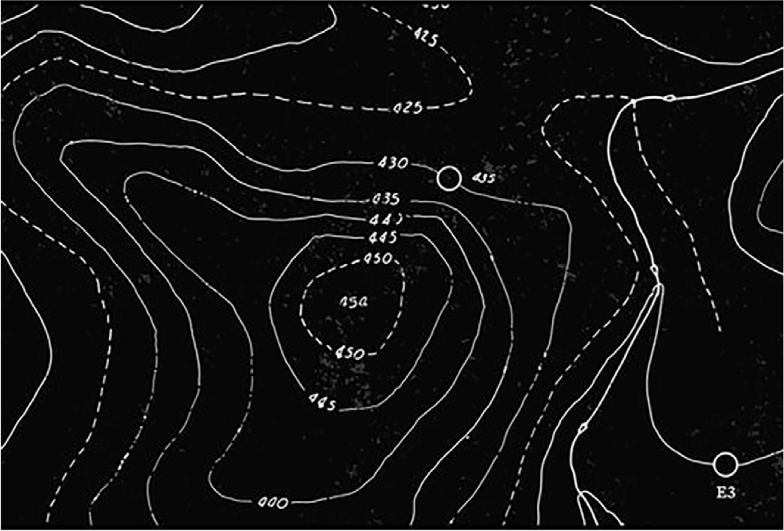
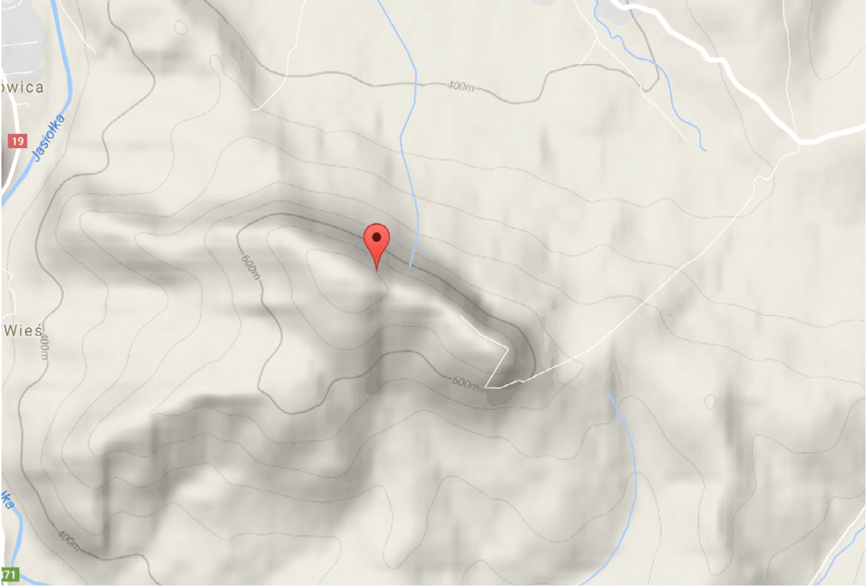
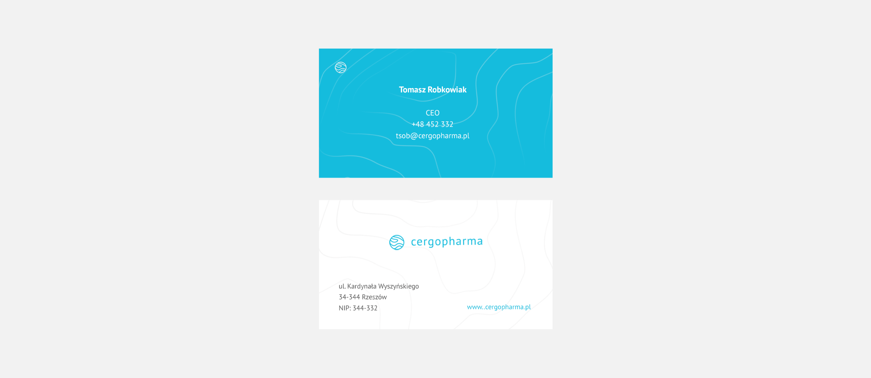
Our starting point and inspiration was the map with contour lines of the Cergowa mountain - the place of the brand’s origin. It served as a basis for building consistent messages.
The emblem’s design is unique and classy - inspired by an old-fashioned signet and topography of the Cergowa mountain. It is located in the surroundings of Dukla, the place of the company's HQ and its origin.

Packaging
How to design packaging of a D3 vitamin that will earn patients’ trust and catch the customer's eye? First, we have conducted some research:
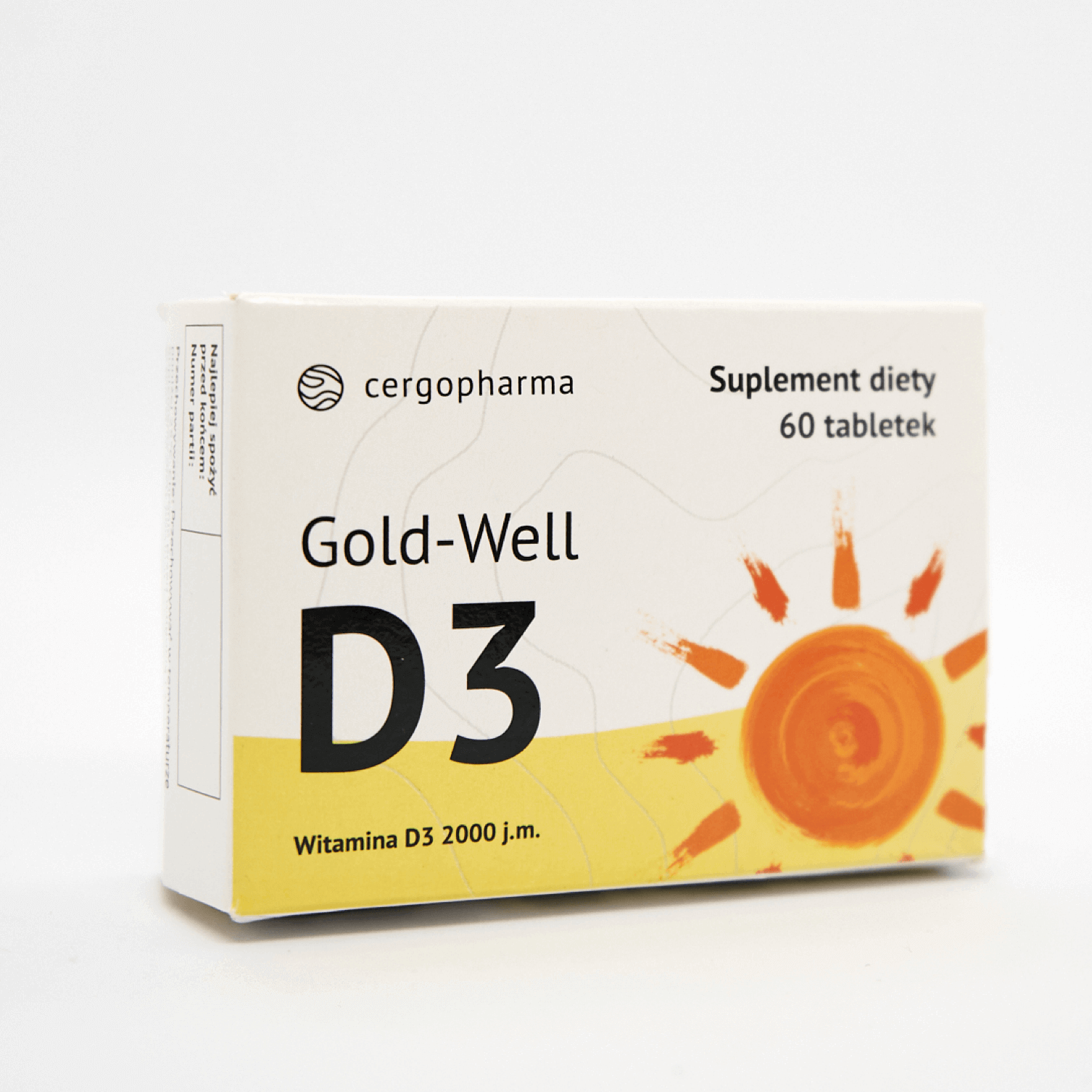
Overview of supplement packets available on the market has shown a distinct lack of products presented in more restrained shades of yellow to white. What’s more, in most packages illustration plays the central role.
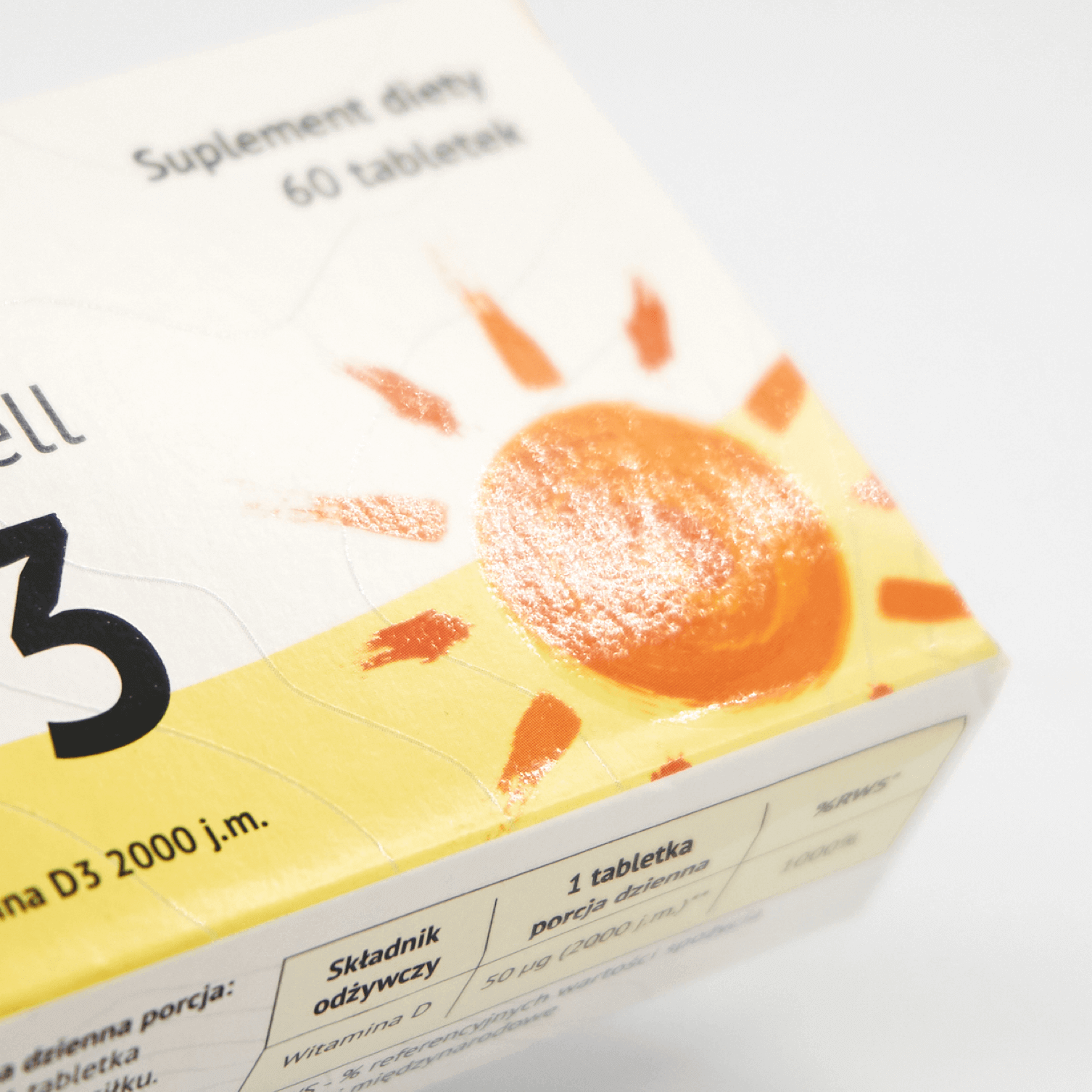
Instead, we have let the topography play the first fiddle. The front page design is deliberately minimalistic - only the essential information for the patient can be found. In certain parts of the surface, you can sense the UV varnish.
The outcome is a unique product distinguishable among the competition available on the market.
Website and marketing strategy
Preparing the product website and a set of sales materials for the client allowed to execute a successful promotional campaign. Inevitable parts of the websites we created for our clients are the EBM reliable content and strong calls to action, as well as friendly UX.
The above case study shows that only the individual approach allows us to create products that earn trust. The success of Cergopharma is an outstanding example.

 Medical Content Creation
 Digital Product Development
 Growth Marketing
