 Medical Content Creation
 Digital Product Development
 Growth Marketing
How to Optimize Your Healthcare Website for Increased Digital Engagement

Optimizing a medical website with a focus on UX is a “must-have” for digital user engagement.
Optimize Your Healthcare Site & Increase Digital Engagement
Healthcare consumers have always been meticulous about exploring med-focused service options. However, technology has changed the way consumers make healthcare decisions.
The average consumer's profile:
- They are more digitally savvy
- They have an abundance of choices within the digital health market
- They are discerning and picky.
As a pharma business, you have no choice but to provide access to healthcare services that follow current consumer preferences.
How to optimize a medical website and provide potential customers with a top-notch experience?
Starting from scratch: identify the traffic source
It's about your user. At this stage, it is essential to answer two key questions: who is your ideal customer, and what does he or she need on your site? By creating a user portrait, which is defined by their needs and motivations, it will be easier and more effective for you to optimize your site.


Users are impatient, while doctors — time-starved
What’s more, both need to find the necessary information immediately. That's why…
#1 Don't overcomplicate it
It is clear that you want to demonstrate all your trump cards to a new user at once. It seems that the higher the number of features, the higher the likelihood of “hitting” the user with one of them. But, unfortunately, that's not how it works. According to Hick's law, the time it takes to make a decision increases with the number and complexity of the options [1].
As with in-app onboarding, new users need progressive learning to reduce the cognitive load. Do you have a feature-rich web solution? Therefore, break complex tasks into smaller chunks or/and highlight what's most important to your user at each stage of site exploration, spicing it up with value-added services (aka features) over time.
#2 Strive for "UI & UX equality"

If a user spends a lot of their time searching for the information they need, your site with a great UI may be useless. Conversely, a site with uncomplicated navigation and simple design can provide a better customer experience and give you a better ROI. The ideal scenario might look like this: the site's UI & UX complement rather than contradict each other.
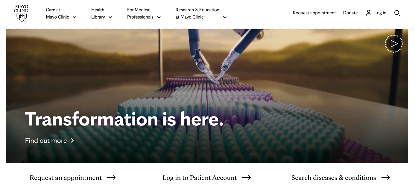
For example, the main page of the Mayo Clinic has a simple design and an easy-to-read font. At the same time, in terms of UX, there is a convenient division of information into sections. For the most impatient, there is a "search" option right at the top.
What is a painless experience for your users?
Perhaps it's one that's not new to him or her. Novelty can be intimidating and disorienting when making important decisions. The so-called Jakob's law [3] comes into play here: since users spend most of their time on other sites, they prefer your site to work like all the other sites they are already familiar with.
However, the UX of your pharma site still depends on who your user is. For example, providing the option to select the font size may be pointless if your user is a medical student. However, aged users may appreciate it. Still, there are general UX rules that will improve your user experience. For example:
- The company logo is placed in the upper left corner.
- The search bar should be in the user's field of view (usually near the center or closer to the top right edge of the page).
- Button text leads to relevant information (placing text about services on the contact page is counterintuitive).
- The company’s USP should be logical and understandable.
- The medical site should be accessible to everyone, so think about implementing such features as a text size changer, text-to-speech options, etc.

88% of clients are less likely to revisit a site after a frustrating experience [4].
Minimalism in healthcare is about a painless experience
According to Hubspot, 84.6% of web designers believe that an overloaded web design is the most common mistake startups make when creating a website [5]. The "place all at once" approach doesn't always work 100%. Indeed, users are not usually pleased to encounter additional hurdles, such as another animation or a combination of bright hues, on the way to finding a solution. It can be distracting and ultimately irritate your users.
Note: We do not mind animations, bright colors, or 3D illustrations on healthcare sites. The main thing is that your site should end up as a unified entity. Therefore, try to create a solution that won't confuse users but will help them seamlessly reach the result, such as making an appointment with a doctor, finding the best vitamin D, ordering instant drug delivery, etc.

What does the minimalist approach involve?
- No more than three colors at once.
- A sufficient amount of negative space as it helps users to focus on the necessary content part.
- There is typically no place for superfluous details, such as color transitions, shadows, complex animations, and unnecessary buttons.
- Each part of the site carries a certain sense of meaning and leads the user to certain features.
- Due to the absence of a large number of pictures and animations, minimalistic sites often focus on the font type.
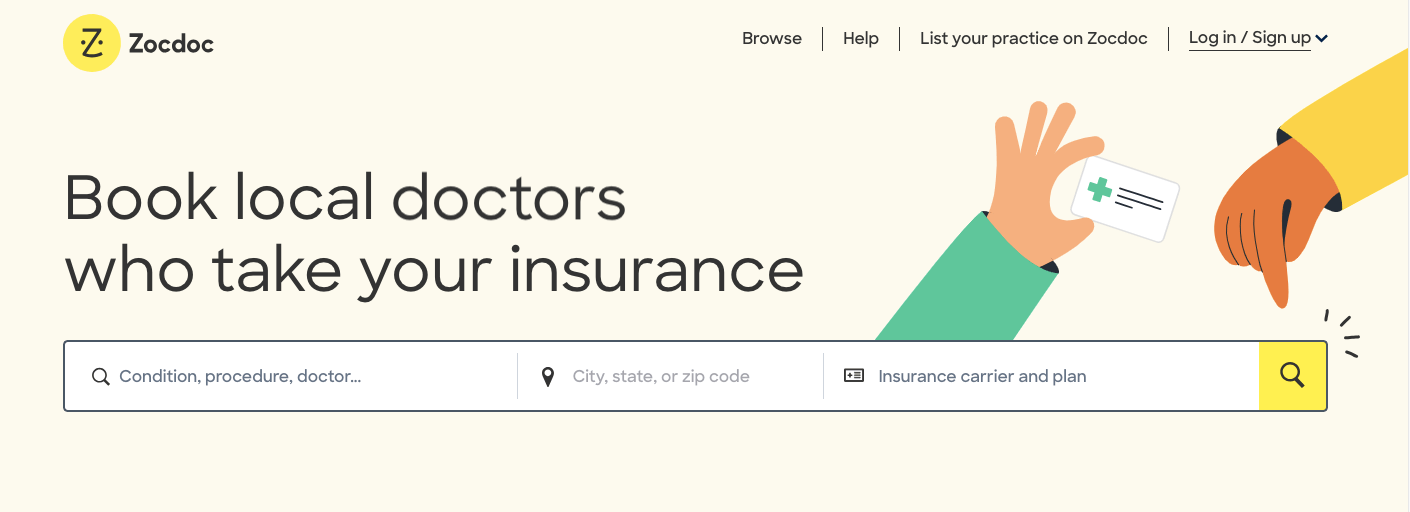
For example, Zocdoc uses plain colors, a bare minimum of illustrations, and provides users with a solution from the first page.
Make sure the site's speed doesn't drive users insane
Although the average user may wait about 2 to 3 seconds before feeling annoyed, don't let your page load for more than 2 seconds [6].
Why it matters
On the one hand, site performance is affected by the server response time, resource load time, caching, and other technical components of your site, as well as the user's Internet speed. But on the other hand, users don't care about tech failures.

A poorly-loaded page is fraught with the following:
- Slow response times mean fewer customers, less engagement, and lower conversions and sales.
- Page speed is also a key ranking factor for search engines. Your position in the SERPs can be affected if your site takes too long to load.
- If we're talking about 3 seconds or more — your optimization can seriously be impacted, with the customer eventually closing your barely-loading site. Moreover, the acquired bad experience is unlikely to encourage the user to give your site a second chance.

Rely on med- and tech-savvy professionals
Creating a medical website is only half the battle. What is truly challenging is making sure it meets safety standards and gets noticed by your ideal med-oriented persona is another. With developers, marketers, UI/UX designers, and healthcare professionals on board, we can help you create and nurture your medical website. Let's make digital medicine more accessible and pain-free together! Contact us, and we'll discuss the details.

References:
- Lawsofux, Hick’s Law, https://lawsofux.com/hicks-law/, [last accessed: 25.03.2023].
- Forrester, What’s The ROI Of CX Transformation? https://www.forrester.com/blogs/whats-the-roi-of-cx-transformation/, [last accessed: 25.03.2023].
- Lawsofux, Jakob’s Law, https://lawsofux.com/jakobs-law/, [last accessed: 25.03.2023].
- Amazonaws, The Trillion Dollar UX Problem, https://s3.amazonaws.com/coach-courses-us/public/theuxschool/uploads/The_Trillion_Dollar_UX_Problem.pdf, [last accessed: 25.03.2023].
- Hubspot, 25+ Web Design Statistics that Are Essential to Know in 2022, https://blog.hubspot.com/marketing/web-design-stats-for-2020, [last accessed: 25.03.2023].
- Hubspot, The Ultimate Guide to Website Performance, https://blog.hubspot.com/website/website-performance, [last accessed: 25.03.2023].
- Stevesouders, the Performance Golden Rule, https://www.stevesouders.com/blog/2012/02/10/the-performance-golden-rule/, [last accessed: 25.03.2023].
